I love taking photographs of landscapes, but very rarely sketch ‘En plein air’ (which sounds very professional but actually means ‘outdoors’ in French).
As the nights draw in I thought I would use my photo references to inspire some sunnier day landscape sketches. It also helped me to think about techniques for creating depth in my work, and to plan ahead for getting out and about on the Island next year.
One of our biggest challenges when we draw or paint a landscape is that we are trying to capture the look and feel of a 3-dimensional view onto a 2-dimensional piece of paper. And our view may be panoramic, breath-taking, filled with detail, overwhelming! – so where do we even begin?
Composition
I enjoy taking photos because I use the view finder on my camera to narrow down my choices and focus in on shape, colour or objects in the landscape that interest me. You can use a camera or a view finder when you are out and about to help you do the same. Don’t be overwhelmed by the outdoors: Select a section that interests you.
The Rule of Thirds
The ‘rule of thirds’ is a great tool to add balance and interest to your compositions, be they still-life, photographs or landscape drawings.

Imagine a grid is laid over your image; 2 horizontal lines and 2 vertical lines spaced evenly apart so that your image is divided up into 9 equal size rectangles. By placing elements of interest on these lines, or where the lines intersect, you start to add balance and flow to your composition.
It’s a technique that artists have studied and employed since the 18th Century. You will find it in paintings, photographs and cinematography.
When you’re next looking at landscapes in a gallery, ask yourself; ‘Where is the horizon’? It might be in the top third of the picture with two thirds of the composition dedicated to rolling hills, grassland or even the sea (seascapes use the same technique). Or is it in the bottom third of the picture so you have two thirds of the painting dedicated to a dramatic sky? Wherever the artist has chosen to put it, they’ve done it for a reason and it will very rarely be placed halfway down the canvas.
Tone
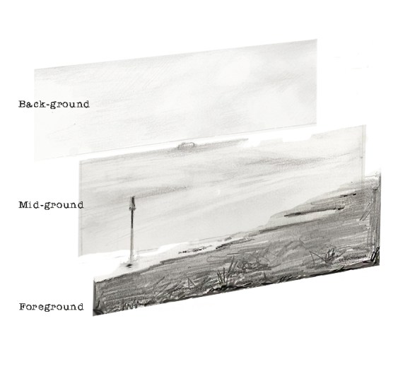
When we look at the section of landscape that we want to draw we should notice that the things nearer to us are crisper and quite possibly darker. As the view recedes into the distance elements may get lighter and certainly less distinct. This is called ‘atmospheric perspective’. If you want to think about depth in your landscape artwork you can use different tonal values to suggest some areas are further away than others.
Landscape artists use these ideas to create a foreground, a mid-ground and a back-ground in their artwork. They may use a darker tone and detail to suggest clarity and ‘nearness’ in the foreground. Towards the background the pencil strokes might be lighter, softer and blended to accentuate loss of focus as we look into the distance.
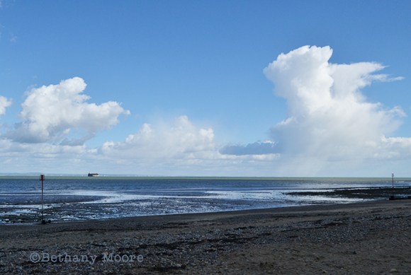
All of my examples are based on my original photo of Ryde sands looking across The Solent towards Portsmouth (incorporating one of the Solent Forts) but hopefully these are principles that you can use to sketch or photograph outdoors and help you think about creating depth and interest in your landscape work.
I’ve also done a blog on Linear Perspective if you’d like to know more about the subject and want to think about adding buildings into your artwork.
